SCHOLASTIC CANADA
SEESAW READING CLUB, REDESIGN
SEESAW READING CLUB, REDESIGN
CHALLENGE
To create a design strategy for the Scholastic Reading Club’s SeeSaw flyers. Incorporate new design trends without hurting the classic image of a 100 year-old brand. Managing a variety of font styles and still maintaining a clean, simple look for the flyers.
APPROACH
Primary goal while designing this project was to open a successful dialogue between the creator and multiple audiences such as educators, parents and kids. I choose the mix of multiple typestyles rendered in a way that would evoke a mix between more bold colourful art works and typography resulting in series of flyers that are rather child-friendly, all with attention to detail. This resulted in raising the sales of featured products from classroom book-orders.

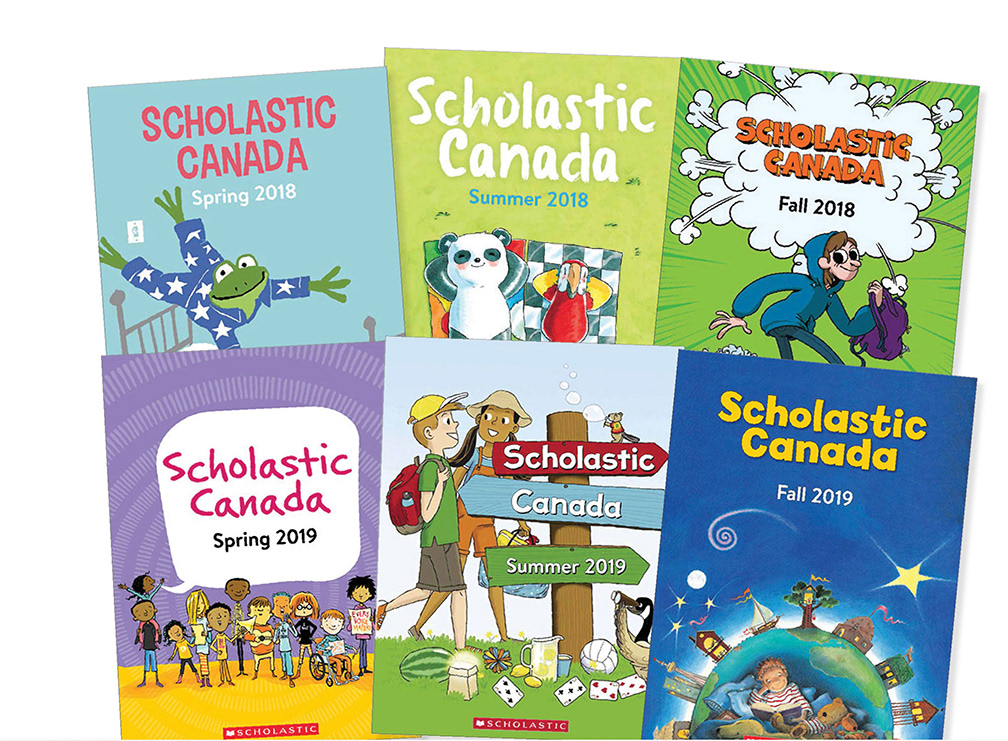
SCHOLASTIC CANADA
TRADE CATALOGUES
TRADE CATALOGUES
CHALLENGE
Published every quarter, each catalogue highlighted an imagery from the star featured book for that respective quarter. The cover and interiors were suppose to match the typography of the respected book without harming the original design.
APPROACH
Carefully matched typography was selected for Scholastic Canada header on the catalogue cover as well as the suitable and eye catching imagery was chosen to create a simple but effective look highlighting each quarter.
SCOPE
Research, Print and online promotional catalogues


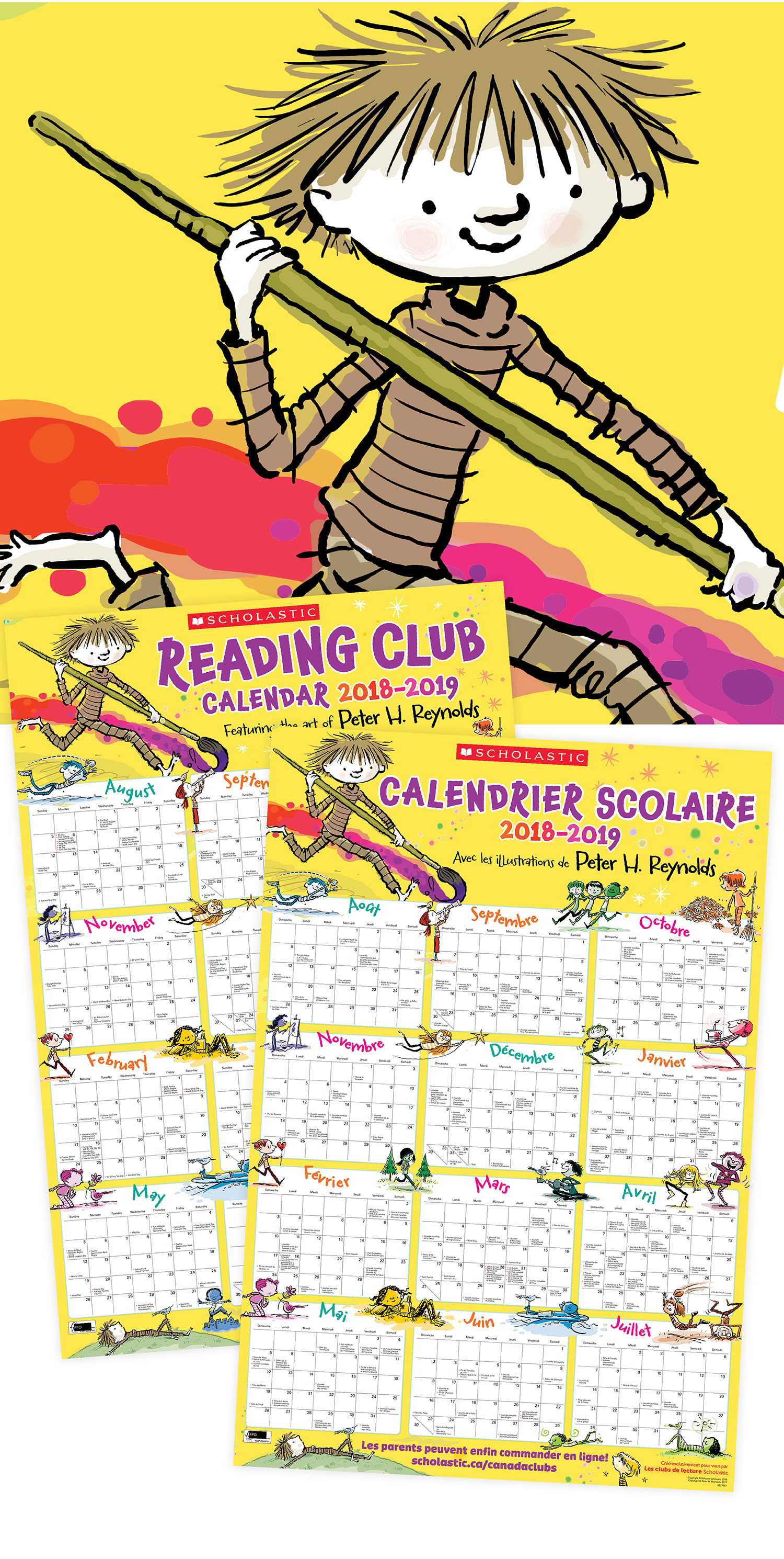
SCHOLASTIC CANADA
READING CLUB SECRETARY'S DOUBLE SIDED CALENDAR
READING CLUB SECRETARY'S DOUBLE SIDED CALENDAR